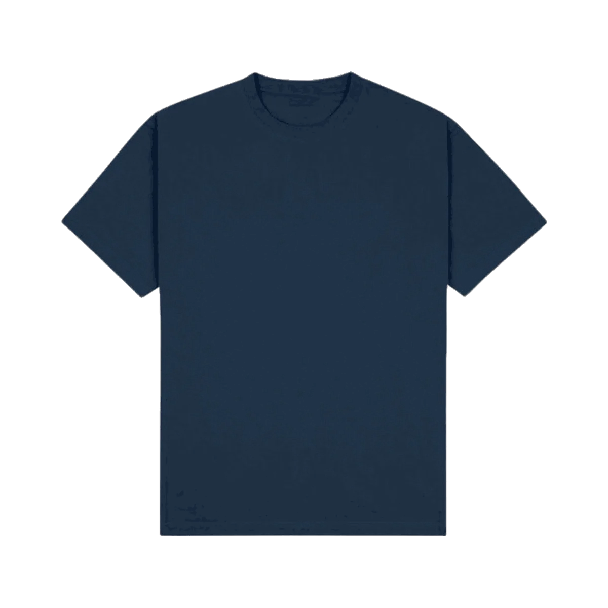
Most merch doesn't fail because of a bad logo. It fails because of a handful of small, avoidable decisions made after the logo was already approved, placement, colour, fit. Here's what we see most often, and what we'd do instead.
Logo placement: bigger and more central isn't more effective
A large centre-chest logo is the default because it's the easiest option, not because it's the most flattering one. A smaller left-chest placement, or a logo scaled to the actual garment rather than a template, almost always reads as more premium. The goal is a piece someone would wear even if they didn't work there, not a walking billboard.
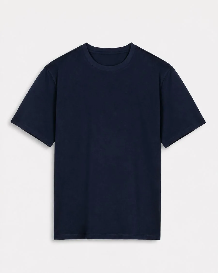
Considered placement
A smaller, well-positioned mark reads as intentional, not oversized.
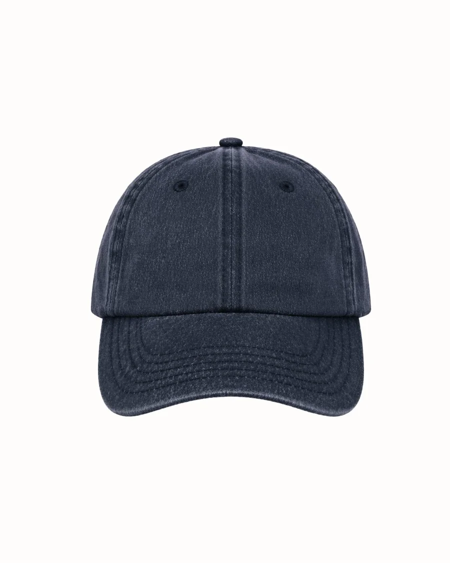
Restrained branding
A cap or accessory doesn\u2019t need the full logo lockup to be recognisable.
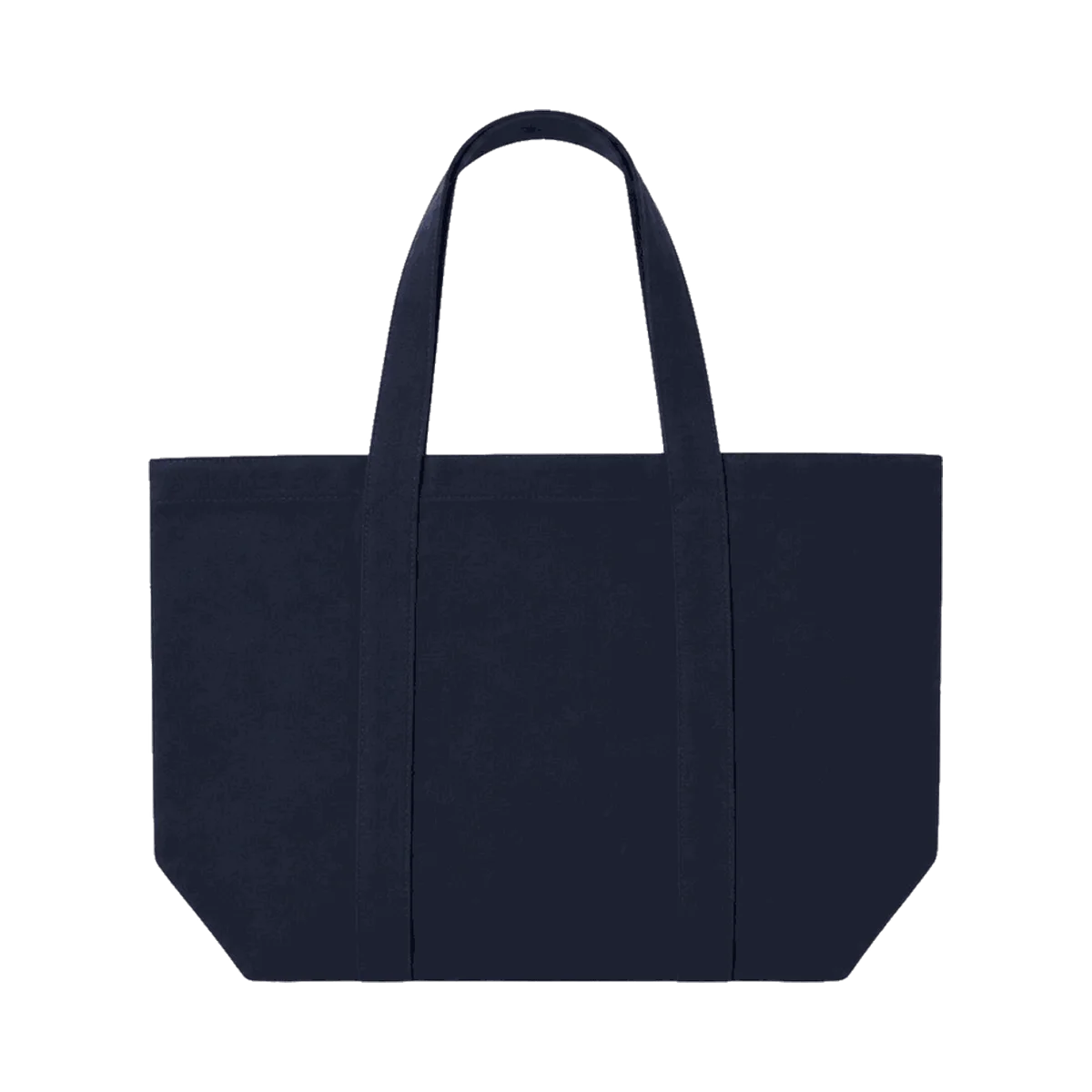
Clean execution
One well-placed mark outperforms multiple competing placements.
Colour choices that fight the fabric
A colour that looks correct on a screen can shift noticeably once it's dyed into real fabric, and different fabric weights and weaves take colour differently even from the same dye lot. This is exactly why we colour-match against a physical swatch before cutting anything, not against a screen render.
Fit decisions made for the mockup, not the person wearing it
A single unisex cut, chosen to simplify ordering, is one of the most common reasons finished merch goes unworn. It flatters a narrow range of body types and fits everyone else poorly. A real size range and, where the budget allows, a genuine fit split costs comparatively little at the production stage and changes whether the finished product actually gets worn.
Over-designing for a single moment
Artwork built around one specific event, a conference theme, a campaign tagline, a dated year, can't be reordered later without looking out of place. A cleaner, more durable mark that works this year and next year saves a full redesign cycle every time the piece needs reordering.
Skipping a physical sample
The single biggest design mistake we see isn't a design choice at all, it's approving a full production run from a digital mockup without ever checking a physical sample. Fit, colour and decoration all behave differently in the real world than on a screen, and catching an issue on one sample is far cheaper than catching it across an entire finished run.
What we'd do instead
- Scale the logo to the garment, not to a generic placement template.
- Match colour against physical fabric, not a screen.
- Offer a real size range, even if it adds a small amount of complexity to ordering.
- Design for reorder, not just for the first run.
- Always sample before full production, no exceptions.
See how we review fit, colour and placement before anything goes into production.